
Infographics & Data Visualization
I never knew that taking one class my senior year of college would lead to a lifelong love of communicating complex information. Breaking down complicated data into clear-to-understand visuals is always a joyful challenge.
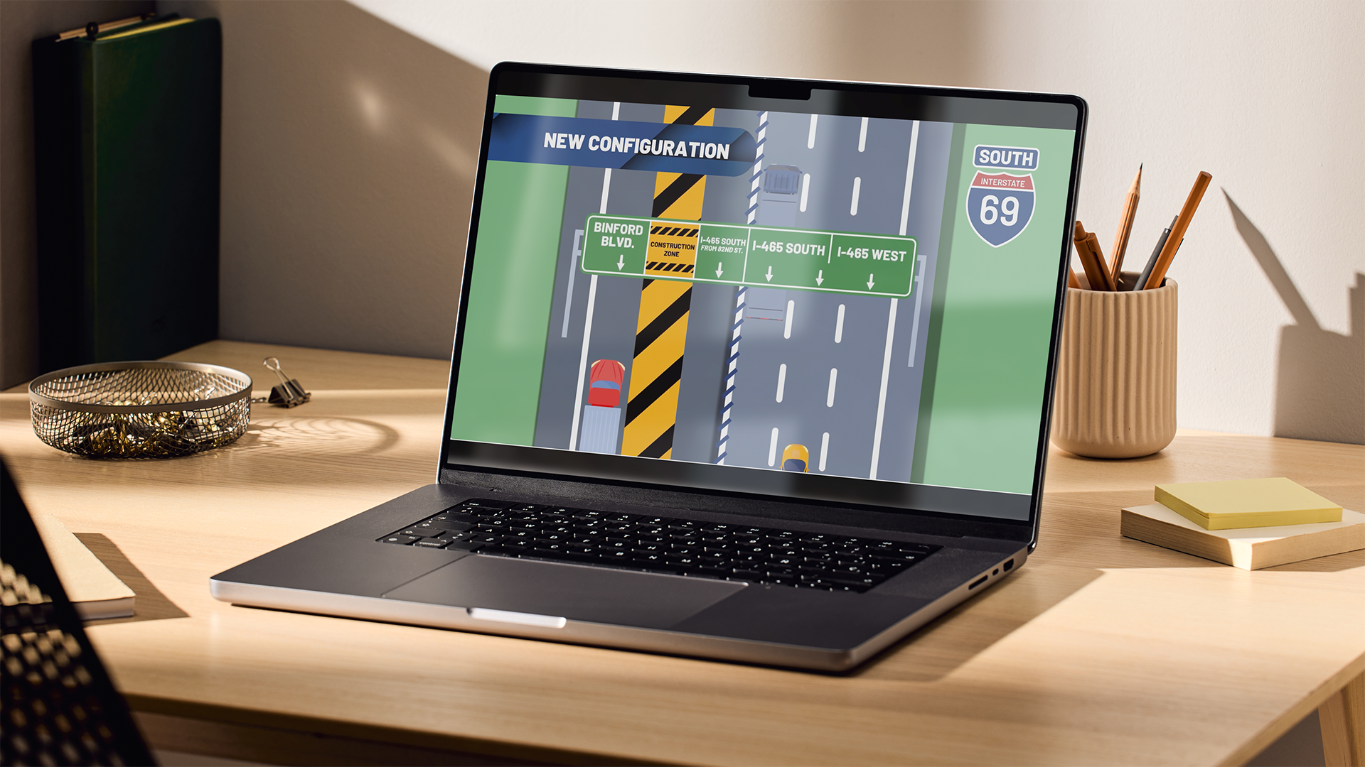
Changing traffic patterns on your daily commute are a major headache. This infographic was used to highlight which lane you needed to be in to get where you are going. Click the image to see the full motion graphic.
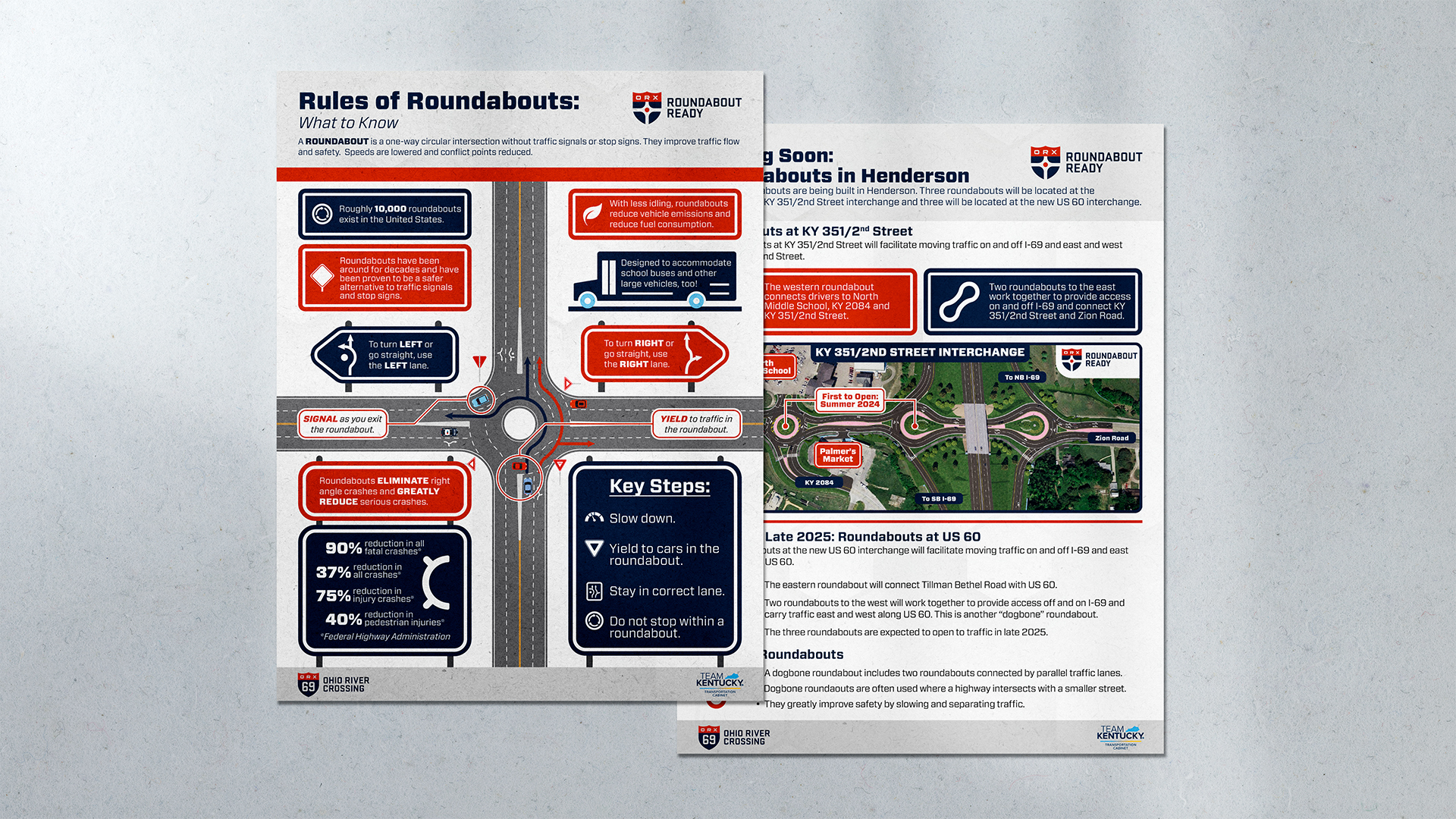
The city of Henderson, Kentucky introduced roundabouts in 2024. While many communities across the country have accepted the new normal, roundabouts in Henderson was a big deal. My team had to communicate effectively that these roundabouts were safe & easy to use and would ultimately benefit their commutes. Our Roundabout Ready campaign was a huge success in educating the public.
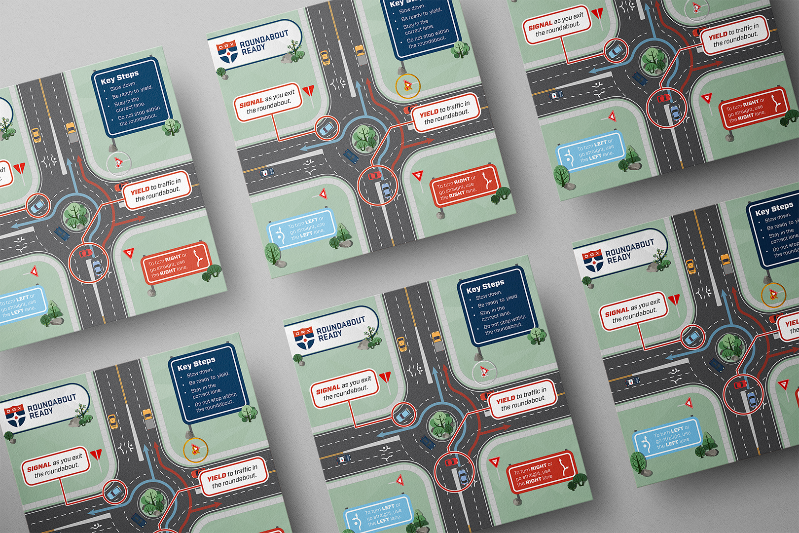
Made in conjunction with our Roundabout Ready campaign (image 1 on this page), we also wanted to clearly communicate to drivers how to properly use a roundabout to maximize safety & efficiency.
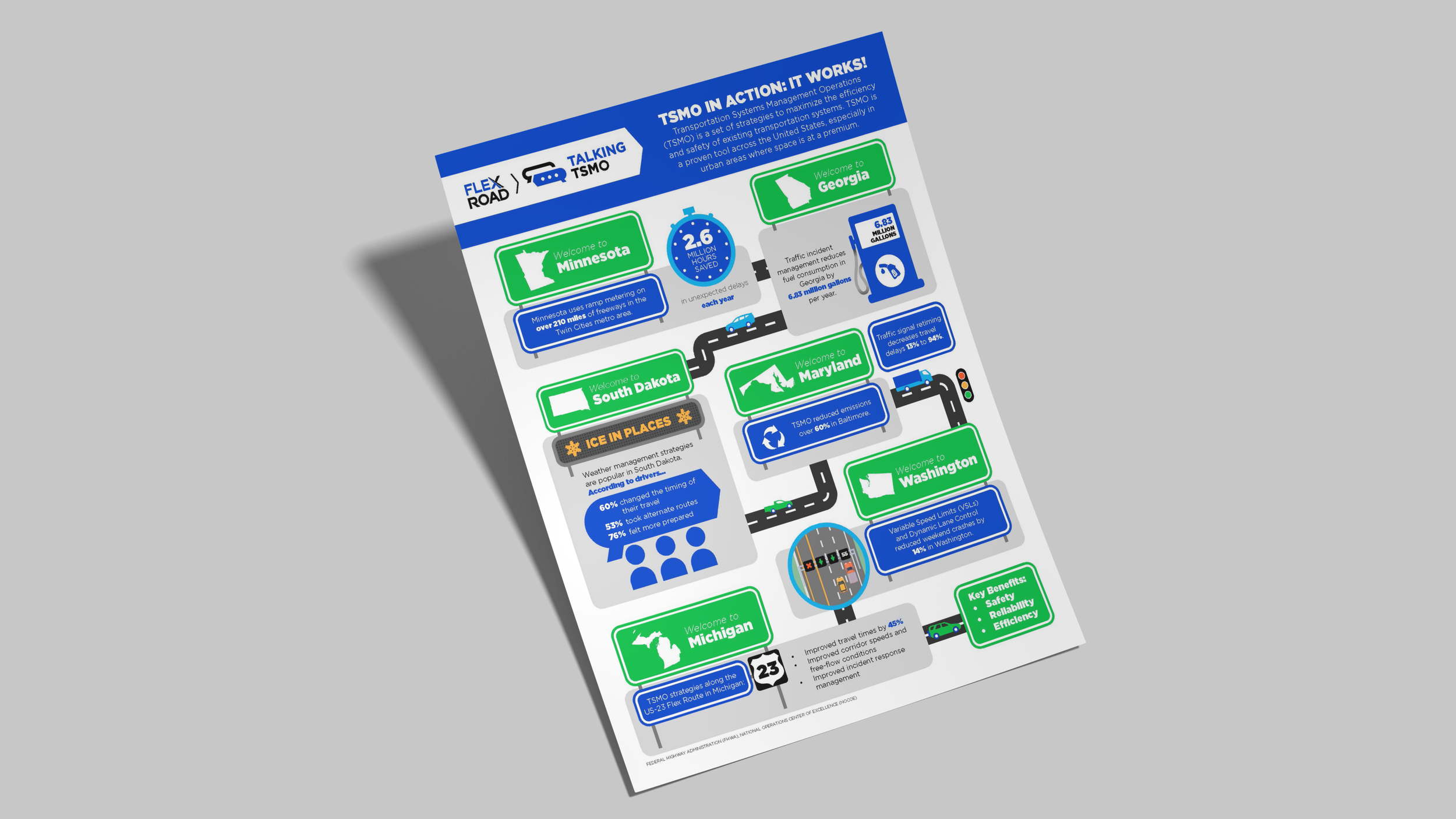
INDOT wanted to communicate the benefits of Transportation Systems Management & Operations (TSMO) to the FlexRoad 80/94 project area (northern Indiana). Our team focused on highlighting the improved safety and preparation that drivers would experience with the implementation of the changes to their commute.

I wanted to purchase a fretboard chart for my bass & guitar, but I was unhappy with the designs I saw online. I decided to create my own poster for standard bass & guitar tuning that now hangs on my office wall.

A journalistic infographic communicating the scale of terror attacks across the US.

A clickable information map I created in Powerpoint. Each subsection of the the circle links to a different slide in the presentation representing the five values across the three different levels.

A journalistic infographic showcasing the worsening conditions of the Dachau concentration camp over the course of World War II.

Indianapolis Aruna 5k Run Route Map